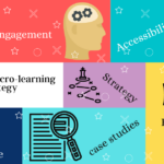
Create Engaging E-learning through Visual designs

The effectiveness of any e-learning course is only as good as it’s instructional design. Yes, Informational content is very imperative and always comes first in an e-learning course, but Quality visual design is a close second.
If you come across an e learning course that has poor design, outdated images, slow transitions or weird voice overs, you may not like to learn from it even if it has good content. Millennials need good visuals to learn from. They expect engaging designs, they learn from images, videos, well designed and interactive visuals. Visuals designs can make or break a learning experience.
Benefits of engaging e Learning designs:
- It catches the attention of the learners.
- It helps in retention of the subject
- Deeper learning and faster course completion.
At Falco, we take great care and interest in creating best visuals along with the informative and engaging content. Here is how we do it.
Choose Images and icons which are impactful:
Always choose images and icons that reflects the content of the course. The images should be of high quality and can connect emotionally with your learners. Keep the images as close as possible to the reality. If your course is related to a certain software or tutorials, use real pictures or snaps from that software to make it easy for the learner to understand the concept better. Also make sure to select the images which have more emotional connect with the learner. At Falco, we research the learner, to make sure that we are selecting the right images and that the images don’t offend the learner. Because a friendly handshake in one culture, doesn’t mean the same in another culture.
Choose your background wisely:
Pay extra attention to the background. Use pleasant colors to keep it simple and attractive. Stick with 2-3 colors. Avoid using all the neon colors in the Rainbow. Younger audience likes simple look better. Plan well in advance in order to avoid any major fixes when you are half way through your course. Follow the colors of your brand to make it look authentic. At Falco we take ours or our client’s brand guidelines very seriously. Choose a template that blend seamlessly with your images, graphics and the font color.
Font works wonders:
Choose the fonts that are easy to read. You don’t have to choose most creative types but the font which makes the text clear and catchy. Use maximum 2-3 fonts throughout the course and it’s best if you choose your font from your company’s brand guidelines. But still if you choose a font which looks innovative and elegant like calligraphy or cursive, make sure it passes the readability test. There are some regular and safe fonts to use like Times new Roman, Calibri, Helvetica etc., But if you want to use some different fonts and the readable fonts at the same time, you can also try Constantia, Cambria, Centaur etc.,
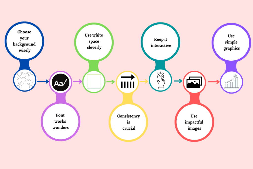
Use white space cleverly:
Don’t treat white spaces as a bane. A common mistake that most designers do is try to fill up the white space with text, or images or graphics. As much as you are trying to give your learner as much information as you can, don’t try to fill your white space, instead embrace it. Strategically used, White space can give your course a whole lot of elegance. Split your content into Headings, sub headings, paragraphs and images. Always have an adequate amount of white space.
Consistency is crucial:
Be consistent. When our brains recognize a pattern over and over, our brains subconsciously start to recognize or grasp that information. The feeling of familiarity in all the courses, makes it easier to the learner and stays with the course. If your user doesn’t have to worry about where to go and click where to navigate, he will focus on the content and the course. That way you will gain the attention of the learner and engagement increases. That’s why consistency is crucial for any online course.
Keep it Interactive:
Asking questions and giving some small exercises to practice keeps the e-learning course interactive. Elements such as quizzes, flip cards, sorting activities, are essentials to creating a powerful (and beautiful) learning experience. Keep it as realistic as possible and close to real life experiences. The best you can invoke emotional quotient of your learner the best you can engage with the course.
Use simple graphics:
Simplify the content by using info-graphics, charts and graphs. Very complex content can be explained in a simple way if it’s well presented in the form of info-graphics or charts. Try 2-3 ways to present the content and see what best work. If you are not sure if the graphic is clear, show it to a co-worker or a friend and ask them if they understand the graphic and include it in your course. Make sure to use the colors you used in the entire course in the graphic as well.
Making an e-learning course visually appealing and engaging is as challenging as creating authentic content. By following the above-mentioned tips will definitely help you to make a good e-learning course. We at Falco, through years of experience have mastered the art of creating e-learning courses. It is always best to take the expert help, when it comes to your employee training.